[Star Tips] How I added pops of colour to revamp a white office space...
Just before Christmas, I got approached by a PR agency to help them give their London headquarters a little revamp. Their MD liked my blog and wanted to give their office the 'Stella + the Stars' treatment. They mentioned pops of colour, statement pieces and quirky accessories... They basically had me at hello!
It was my first ever corporate project (I have only worked on residential ones until now) and although I was a little nervous, the team and I seemed to be on the same page after the first meeting, so it sounded like a good new challenge to get my teeth stuck into. And it was.
I met them just before the Christmas holiday to discuss their requirements and go through what they wanted/needed and we took it from there. We worked on ideas, moodboards, colour scheme through January and I started ordering some of the products in February, and the project was completed in March (except for one item). I thought I'd share these with you as well as the result, as, although it's a big office space, not an actual house or flat, the principles of interior styling are often the same and you might get some inspiration and tips from the project to apply to your own home.
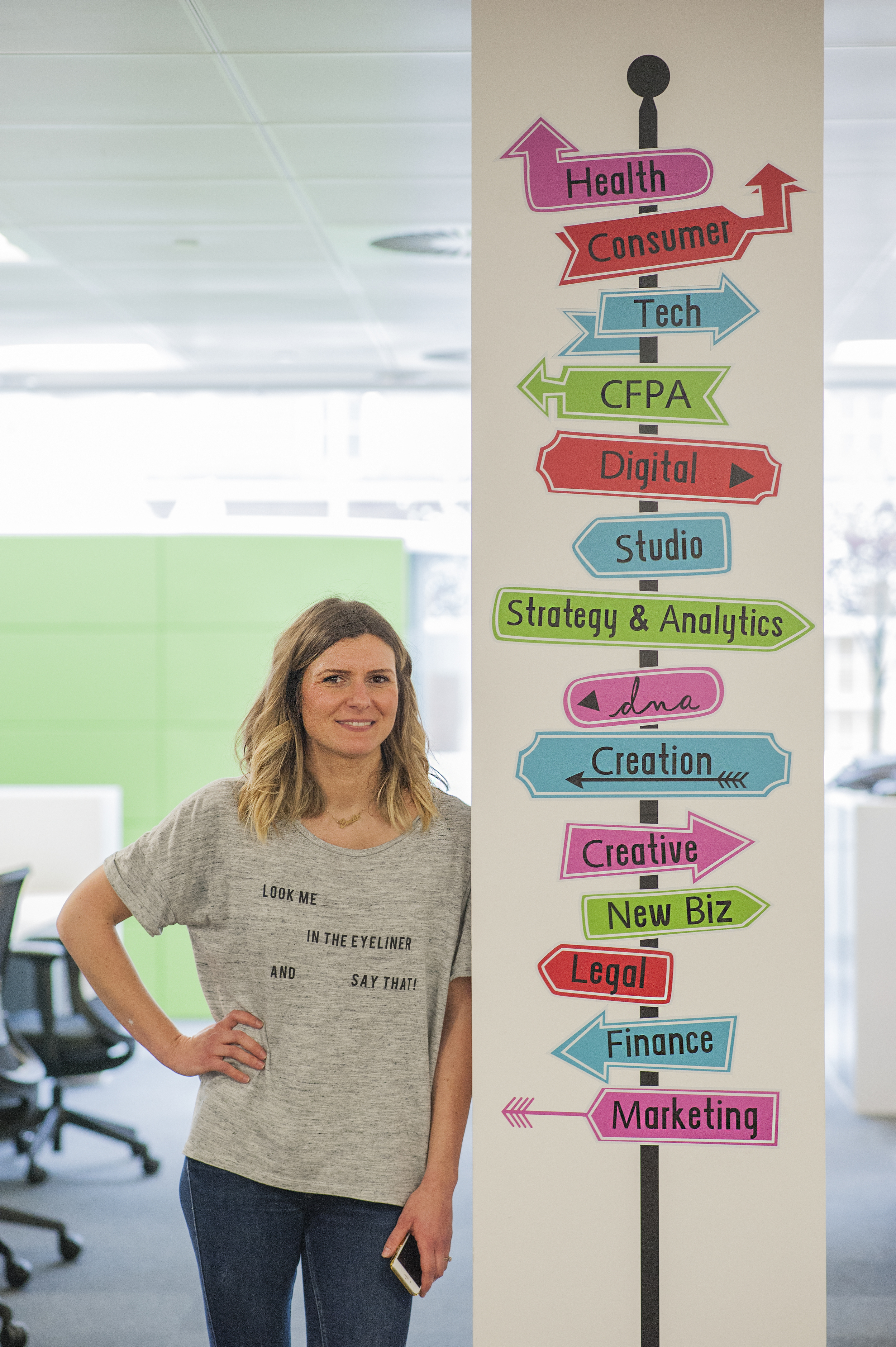
LOOK AT ME IN THE EYELINER AND SAY WHAT? YOURS TRULY STANDING AWKWARDLY NEXT TO ONE OF THE CUSTOM MADE SIGNPOSTING DECALS I COMMISSIONED (PHOTO CREDIT: ELIZABETH ARGYLL)
The Brief
The main objective of the whole project was to improve the look of the London office and make employees feel inspired and proud of their working space. People often spend more time in their office than they do in their own home, and it can be disenchanting to spend up to 10 hours of your day in a bland uninspiring office space that no one bothered to give any personality or care. So it's really lovely to work with companies who actually want to improve the environment of their staff.
The management team were keen to express the company’s creative ethos and heritage throughout the working environment and create a more 'boutique' agency feel. They wanted to add quirky, statement pieces of décor to make the space look more ‘creative’ (erm, hi there!) and add colour to the existing monochrome scheme, while keeping the overall scheme in line with newly commissioned furniture and décor.
So basically, it was the dream project for me. Although their budget was substantial the space was, well, spacious! So I had to be clever on how to spend the money and where. We decided to focus on four areas to improve - entrance mural, ceiling, office pillars and meeting rooms - and if we had any budget left after that, we could look at extra ideas to complete the project.
So shall we just start the tour? Follow me, I'll show you around... Thanks to photographer extraordinaire Elizabeth Argyll for the wonderful shots. Check her instagram account, it's full of beautiful images of London... Oh, and if you like any of the products I sourced, scroll down to my Shopping List at the end...
The result
Entrance mural
The plan was to remove the existing design and replace with something bold, quirky and fun to add impact. The entrance mural got a facelift and I commissioned a custom made neon sign for full impact!
(PHOTO CREDIT: ELIZABETH ARGYLL)
Ceiling
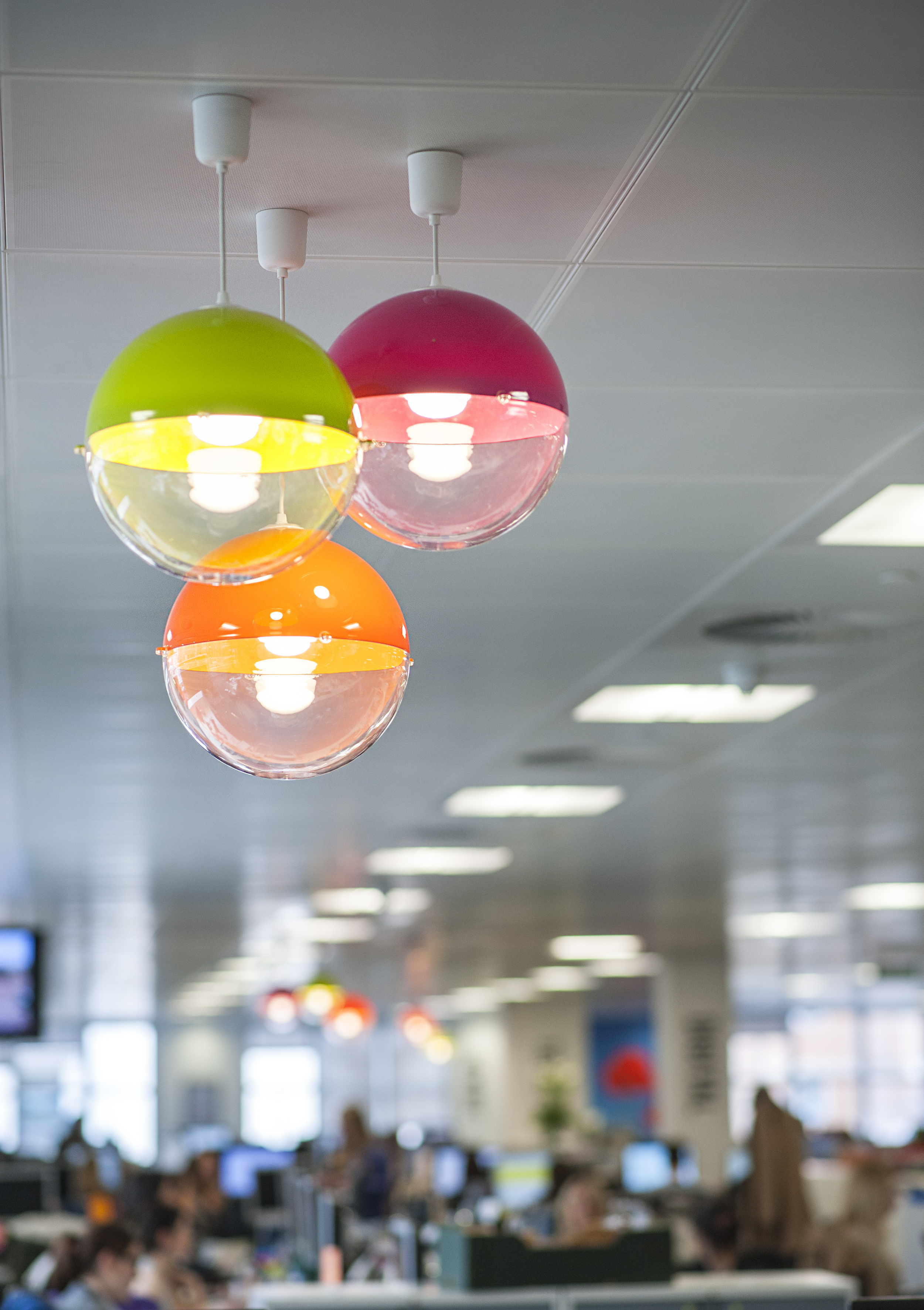
The team wanted to break the current neutral scheme to create something that draws the eye upwards to create a focus point. I sourced a bunch of fabulous and colourful ceiling lampshades and we set them up in clusters of three, dotted around the office.
clusters of colourful lampshades dotted around the office added colour and quirk (PHOTO CREDIT: ELIZABETH ARGYLL)
Office Pillars
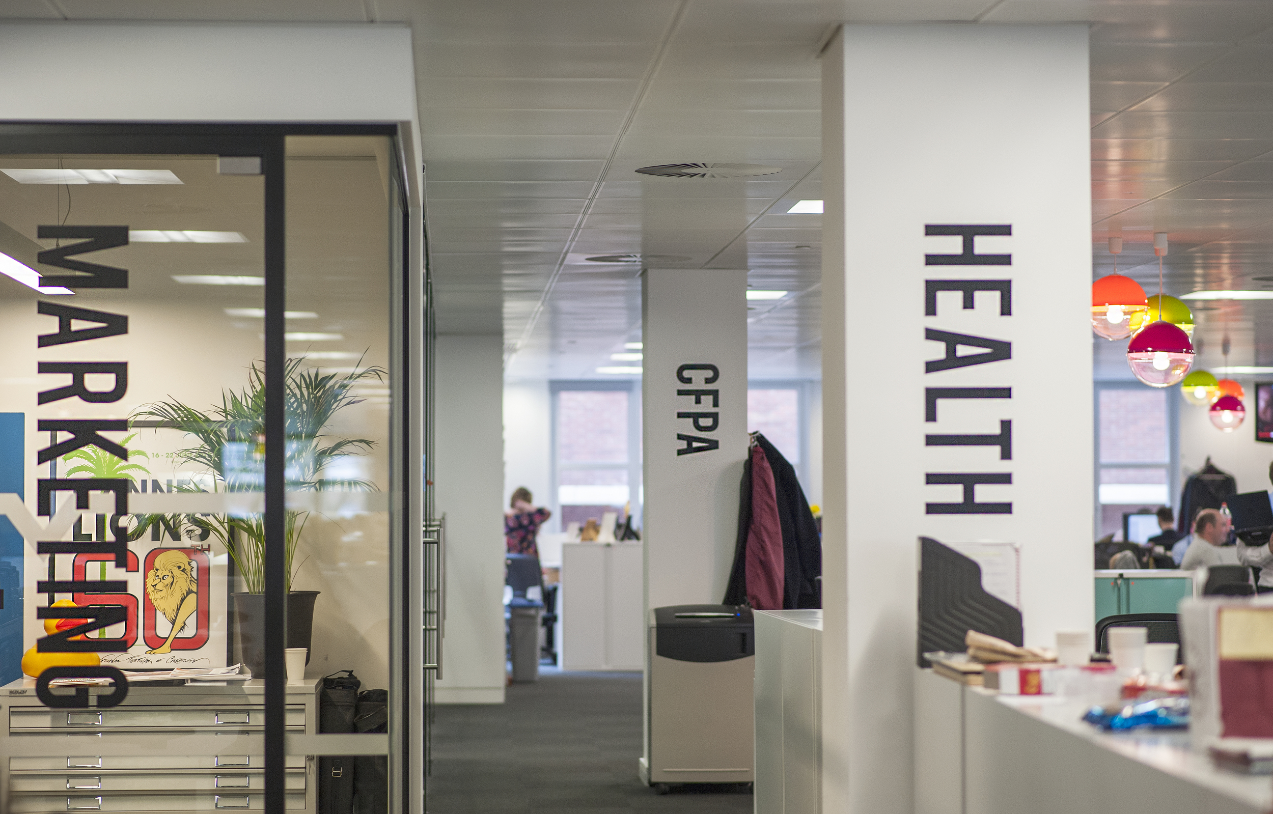
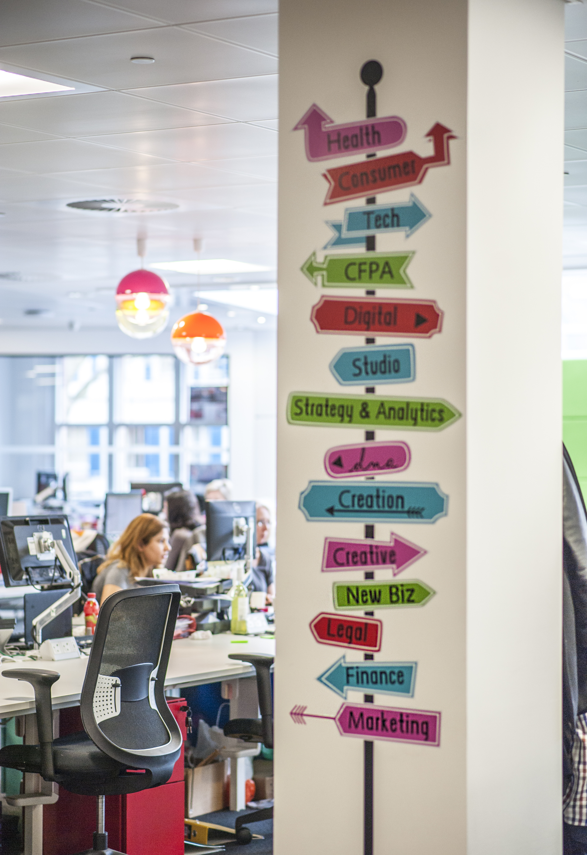
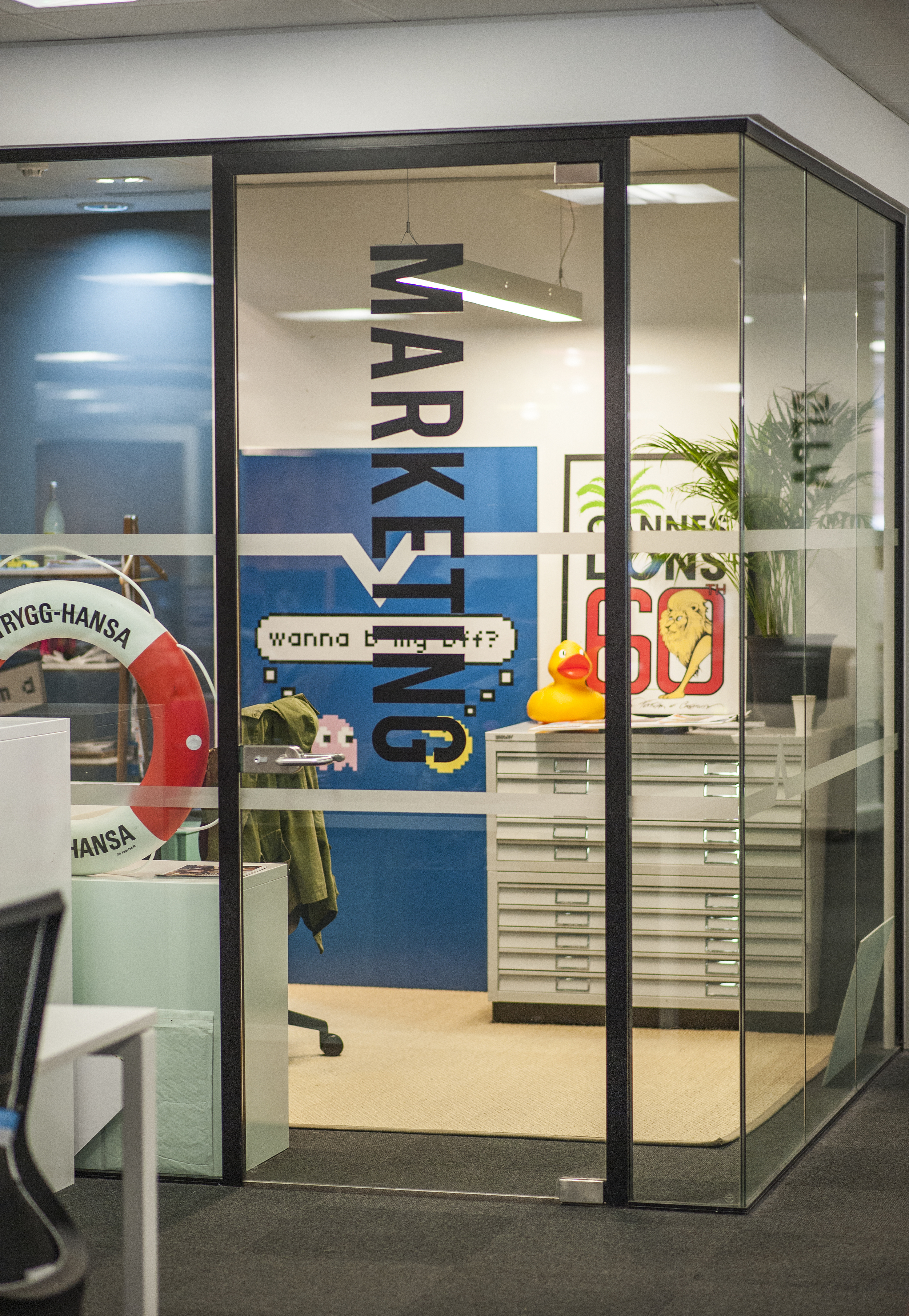
We needed to use these as blank canvases to add colour or pattern, as well as catering to practical needs like signposting divisions, and it had to be flexible/customisable. So I commissioned some wall decals to dress the pillars and glass walls and a more colourful one to signpost each division of the office.
I also proposed they paint the remaining pillars either bright colours, stripes or in chalkboard paint and found a signwriting artist to come in and create some fun doodles on each pillar but that's not been done yet so I can't show you the result. But these pictures below were my original proposed ideas.
Meeting rooms
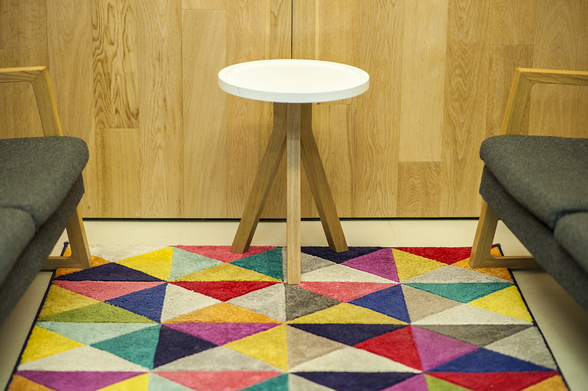
The team wanted to source statement accessories to complete the existing look of the meeting rooms and booths. We had a smaller budget for these, so I focused on texture to try to make the meeting booths more cosy with some colourful, funky rugs. This also helped with reducing echo coming from the meeting pods.
(PHOTO CREDIT: ELIZABETH ARGYLL)
There are also a few accessories I sourced for individual offices and meeting rooms like these fabulous and affordable arched floor lamps that we couldn't photograph. But hopefully the above gives you a good idea of the fun I had! And as promised, here is where you can find below all the colourful things I used in the project...
Shopping List
1. 'hello' neon sign - made by The Neon Sign Store
2. Koziol Orion hanging lamps (orange, green and pink) - available from Red Candy
3. Wall decals and signposting - all custom made by Vinyl Impression
4. Samba multicoloured rugs - available from Modern Rugs
5. Arched floor lamp - from Wayfair.co.uk
As this was my first corporate styling project, I'd love to know what you think? Does it make you want to work in a colourful space like this one? Did it inspire you to add a little pop of colour to your own home perhaps? Leave your feedback in the comments below!

