AL SAFA PROJECT: LIVING and DINING ROOM REVEAL
Due to all the COVID-19 madness, one of the changes we’ve witnessed here at Stella + the Stars over the past year has been the increasing interest in our e-design services, and rightly so. Our Remote Styling package is perfect for clients who prefer to have full control over the execution of their project, with a lower design fee and the flexibility of doing the installation in stages if they wish to. For us, it’s fantastic as it allows us to say yes to more projects however, the downside is we don’t always get to see the results of our designs.
Well, recently, we’ve been incredibly lucky to work with clients who have completely blown us away with the way they’ve managed the execution of our designs. This particular room revamp (well, two room revamps really, in one open space) was managed to absolute perfection after we handed over our designs, shopping lists and contractors briefs and the result is absolutely phenomenal (even if we say so ourselves!). Our clients kindly let us back in to do a bit of styling (oh yes, we had fun with those shelves!) and playing paparazzi to get those juicy after shots.
Design process
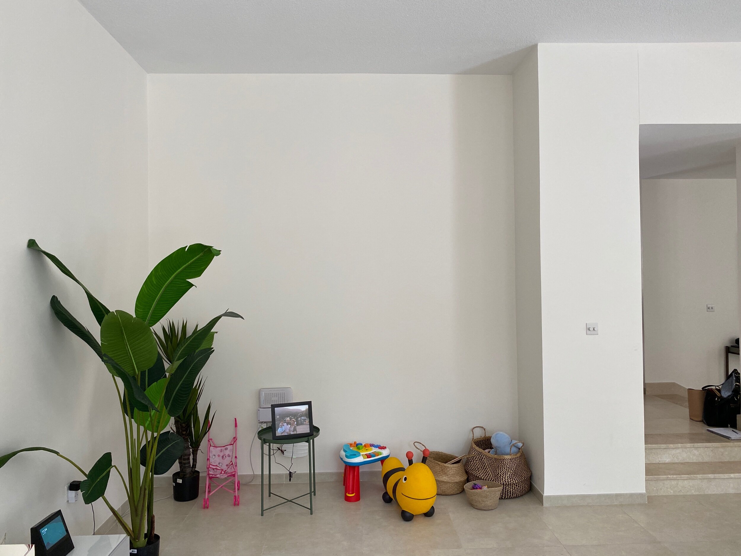
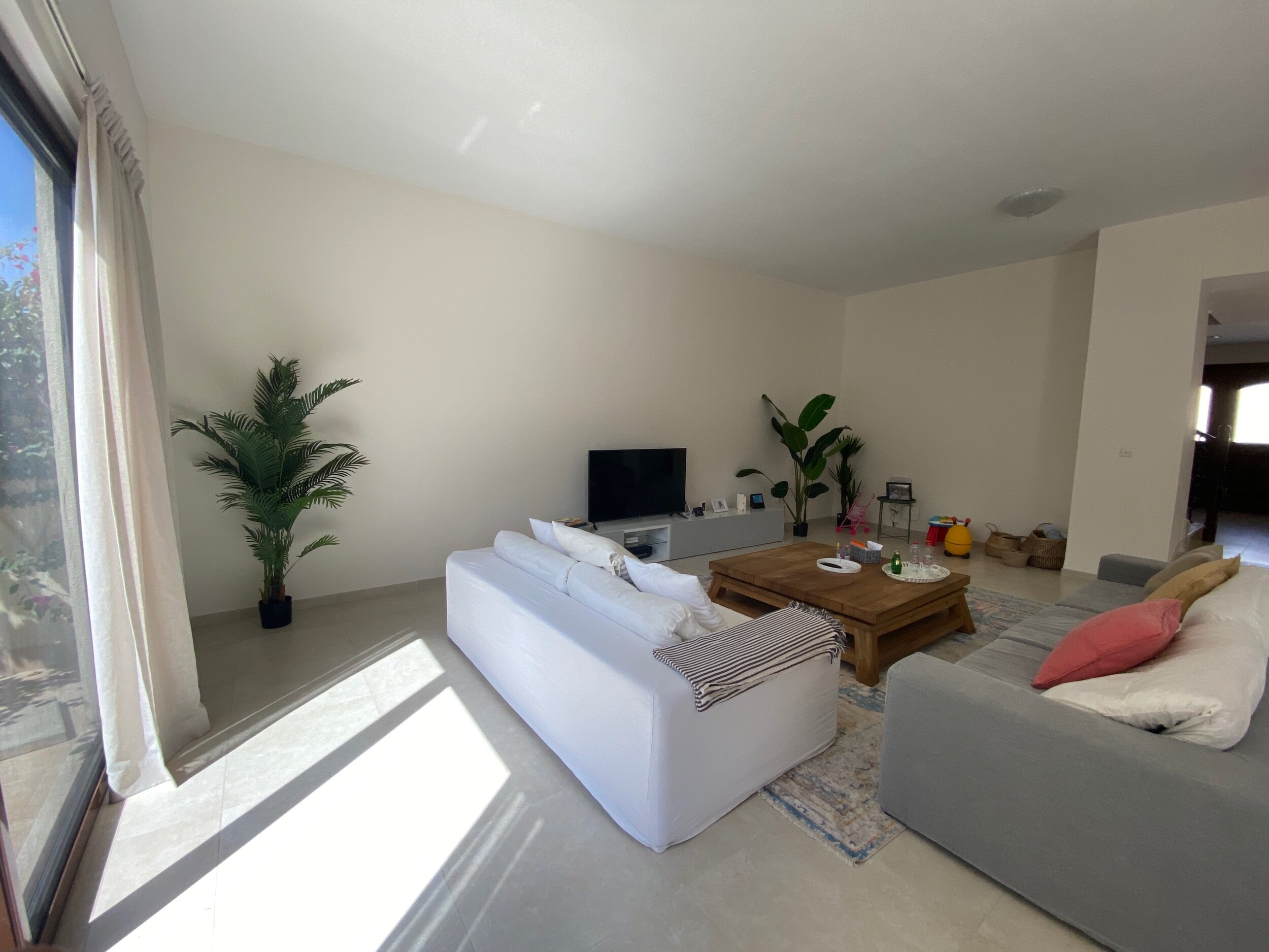
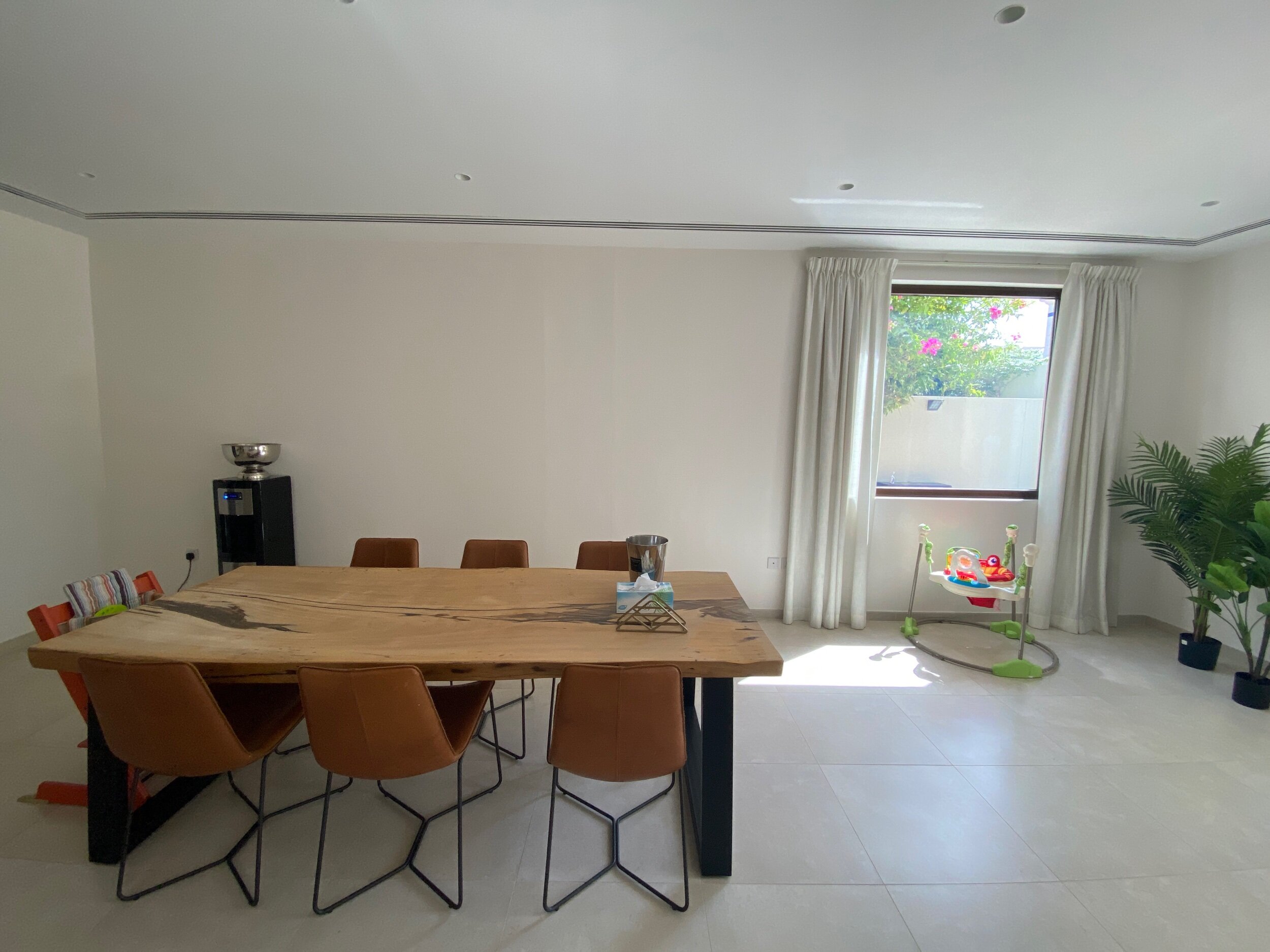
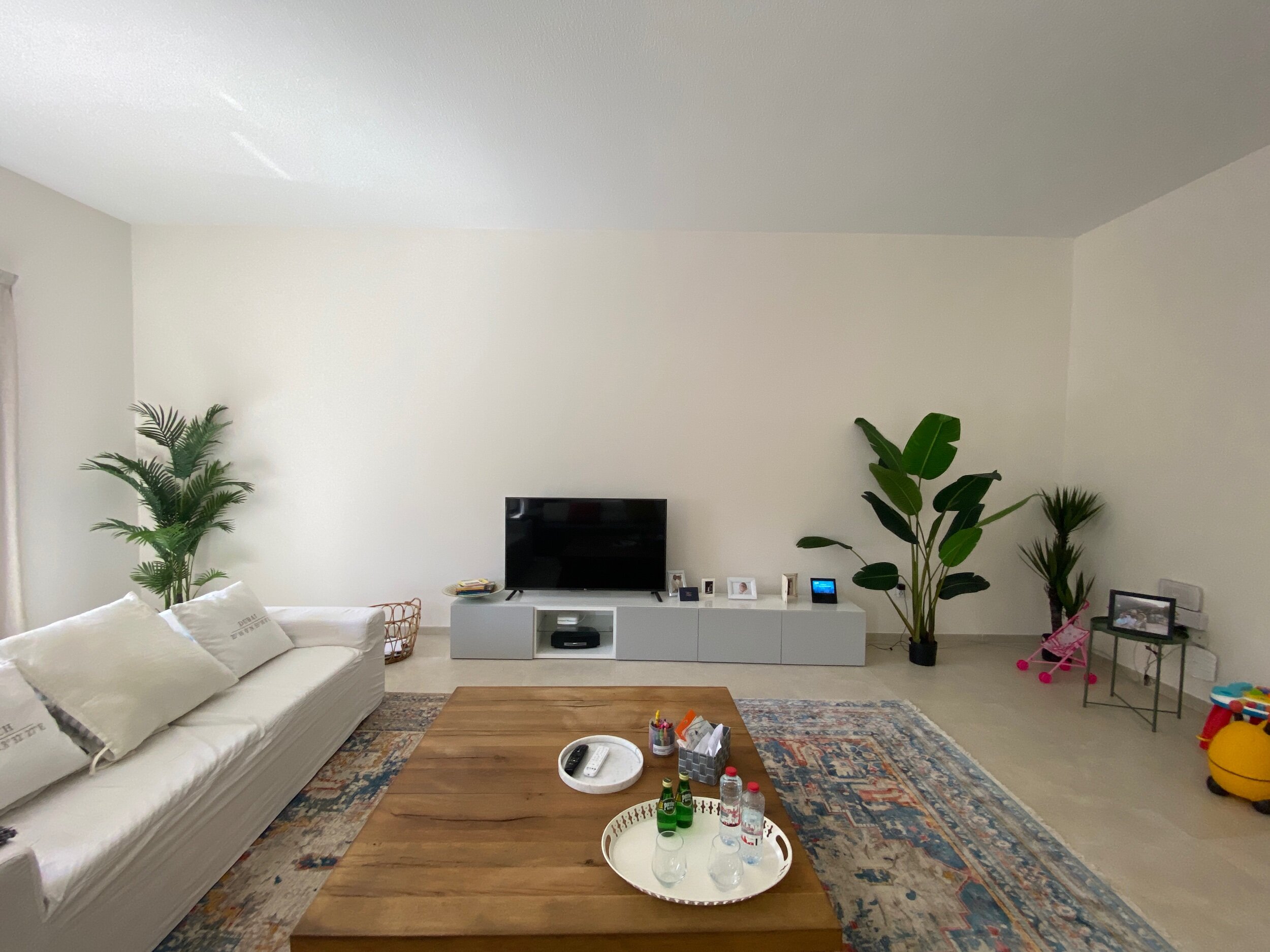
For this particular space, the brief was to transform the room from ‘totally neutral and frankly a tad boring’ to ‘colourful and full of character’ while keeping the main existing furniture. We had to work with some stunning pieces like the dining set and the sofas from Marina Homes as well as the wooden coffee table. The living room rug is so gorgeous in the flesh, we were delighted when we found out our client was happy to keep it - we proceeded to immediately get down on our knees armed with our paint colour chart to find the perfect colour palettes that would work with it, before our client could even say hello.
Before…
Our proposed designs and moodboards
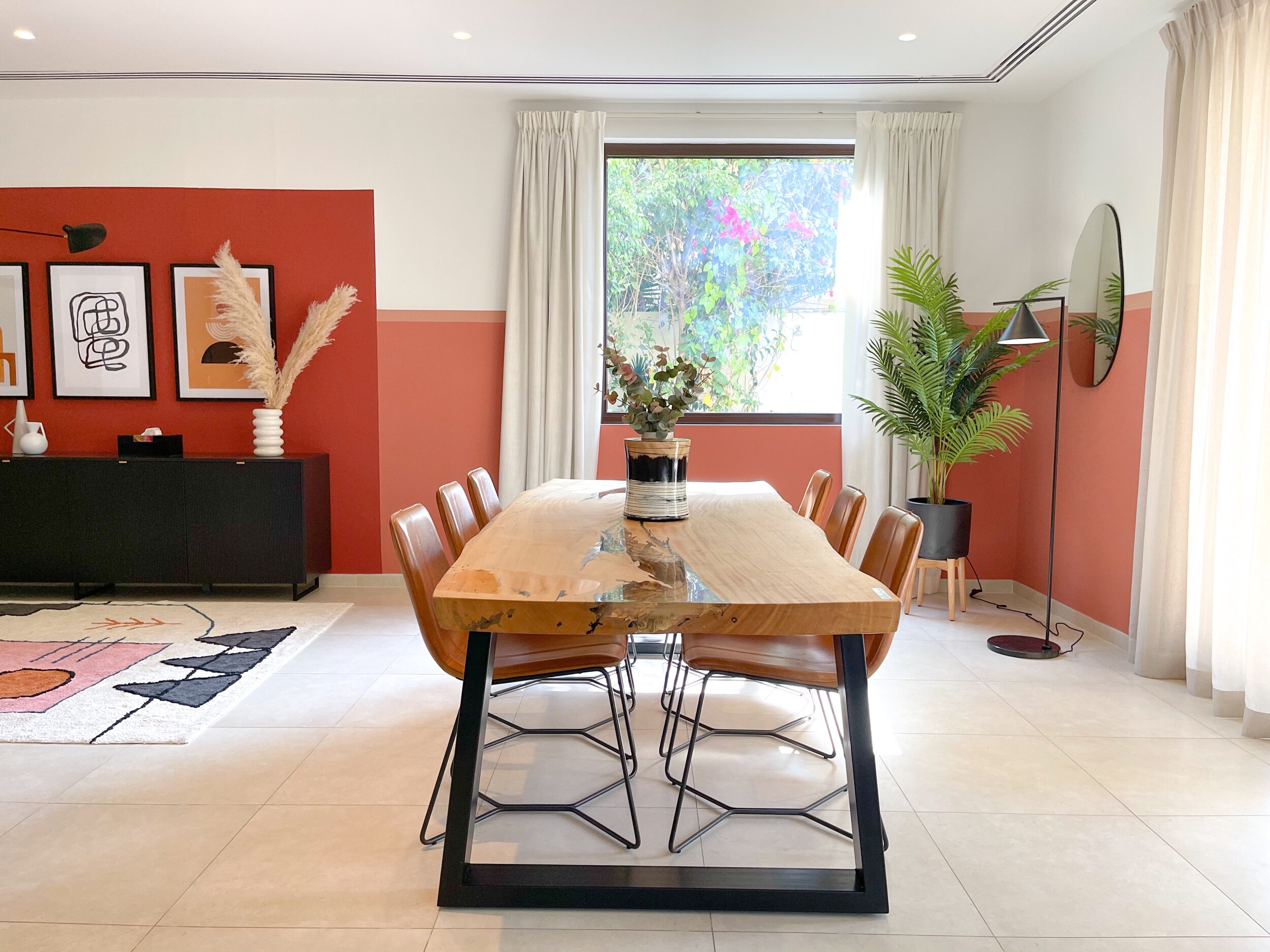
‘After’ shots
Design details
Now, onto the fun bit, sourcing details!
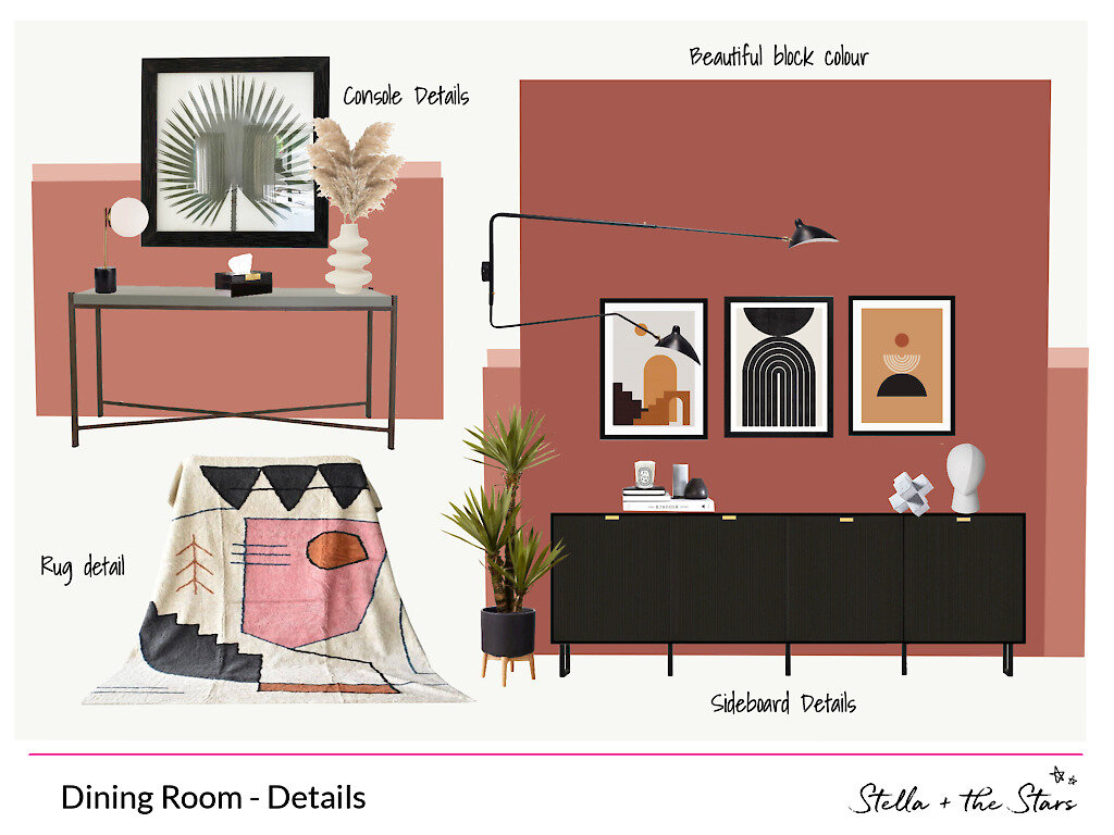
We can’t start without telling you first about the statement paint job! We created this wall design with blocks of terracota, dark pink and peach colours and our now signature stripe on a half painted wall. It’s such a great way to add a bold colour to a large space without completely overwhelming it. How stunning does it look? We used Benjamin Moore Paints and the shades are called Warm Sienna (dark terracota block), Spiced Apple Cider (Half wall peach colour), and Peach Mousse (small stripe across the room). It’s difficult to put into words how much we love the result.
We worked with Fronteriors to not only jazz up the existing TV cabinets with those gorgeous cream and webbed cane doors but they also created the black console for the dining room. The black slatted doors and brass handles are such beauties and our client was delighted with the result.
Dining Room
We found the geometric patterned rug quite early on in the sourcing process and couldn’t get our minds off it! We adore it so much we swore one of us would bag it for ourself if our client didn’t approve it! Thankfully she fell in love with it too and it became the piece de resistance of the dining room.
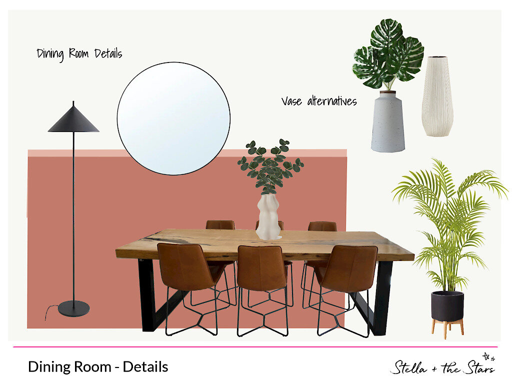
We added a statement lighting - a Serge Mouille curved arm wall light repro - that complements nicely the black steel legs of the existing dining set, and art prints from Drawdeck to add character.
For the rest of the dining room, we did what we do best: mix and match higher end pieces with more affordable products to keep the budget on track. Faux plants from Bloomr add greenery touches while being low maintenance and the decorative items from Luxxe Lighting and H&M Home add the final touches.
Sitting Room
We sourced a few options to add extra seating to the living room and our client ended up choosing these tan leather low chairs to match the dining room ones. Visualizing the different options on our digital moodboards helped her make the decision and she’s delighted with her final choice. Luckily we managed to time the final shopping list to the Dubai Shopping Festival Sale and saved our clients a lot on the big ticket pieces!
We filled the empty nook with some IKEA bookshelves. A simple to give them that designer look is by having the shelves installed at different heights to create zones where art prints and large vases can be displayed. What do you think of our shelfie styling? We had a lot of fun with them!
Et voila! How to redesign a space reusing existing furniture but giving it a completely new and fresh look. What do you think? Would you consider repainting your living room a bold colour?


